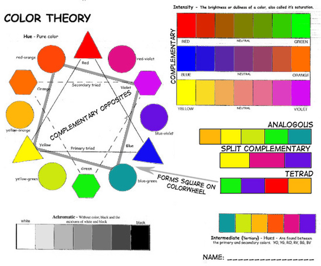
This is my color theory worksheet it did not take me long but it was interesting. My favorite color theory is monochromatic because it is just different shades of one color.
|
|
|
This is my color theory worksheet it did not take me long but it was interesting. My favorite color theory is monochromatic because it is just different shades of one color.
0 Comments
emphasis: the focus of the photo is one thing in particular
black and white: everything is black white and grey sepia: looks rustic and is mostly a brownish color Double exposure: two photos combined to make one weird cool or bad photo boat n hand: uses distance to confuse the mind silhouette: a shape of a person or object where light makes the outline black rule of thirds: if you separate a photo into three by three boxes the focal point should be on the corners of the boxes 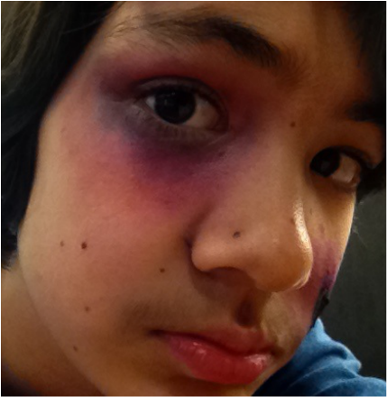 This is what happened to me saturday. So I got into a fight with another kid in my class named Tim he kind of punched me in the face, so yeah...
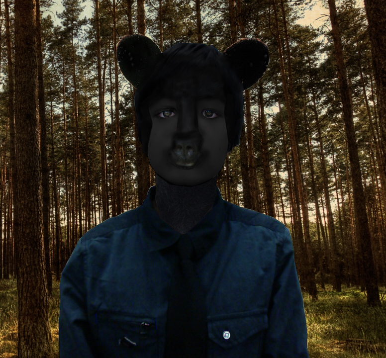
Just kidding this is a moulage. How it was made was by first putting black paint around my eye, then mixing in purple, and finally adding yellow which made it look like I was hit in the face, ouch!  I think that certain things can be photo shopped but others should not, like this duck is something that can and should be photo shopped while models should not be because it is like lying, but this duck on the other hand is funny to photo shop and it is not as bad to photo shop this because it is not lying as much as the photo shopping models is.
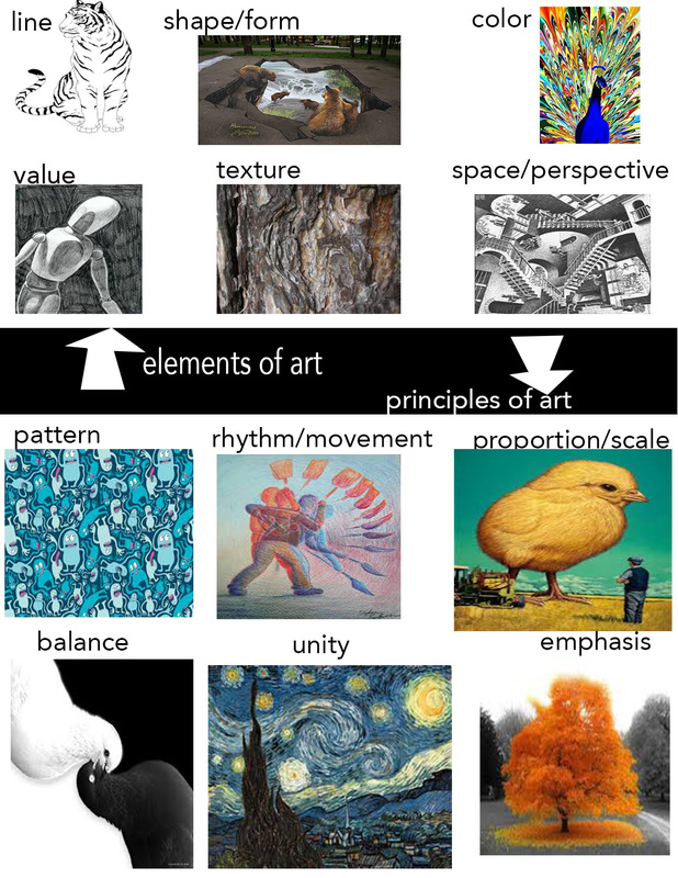 My favorite element of art is shape/form because people can make tons of 2D art that looks 3D. My favorite principle of art is proportion/scale because it lets the artist play with the size of things, like making things that are usually small big and big things small. e and p link
|
Joseph SweatI do karate and I am a green belt. I have a youtube channel mangoinparis729 Archives
January 2016
Categories |
 RSS Feed
